Calligraphy for beginners: the pens, nibs and paper you need, basic strokes to practise and how Celtic lettering can inspire your work.
Embarking on My Calligraphy Journey
The elegant dance of ink on paper has always captivated me. There's a timeless allure to beautifully formed letters, a quiet power in their deliberate curves and precise lines. For years, I admired calligraphy from afar, seeing it as an art form reserved for the exceptionally patient and inherently artistic. But then, a little voice inside me whispered, "Why not try?" And so, my personal journey into the world of calligraphy began.
This article is a chronicle of my initial steps, a guide for anyone else feeling that same pull, offering insights into the tools I discovered and the very first strokes I attempted. I'm writing this from my perspective, sharing what I've learned and the challenges I've faced, hoping to make the path a little clearer for fellow beginners.
Why Calligraphy? My Personal Motivation
Before diving into the practicalities, I want to share why calligraphy appealed to me so strongly. In our fast-paced digital world, there's something incredibly grounding about slowing down, focusing on a single task, and creating something tangible with my own hands. Calligraphy, for me, is a form of mindful meditation.
It demands concentration, patience, and a delicate touch, forcing me to disconnect from distractions and truly be present in the moment. Beyond the meditative aspect, I was drawn to the sheer beauty of it. Imagine crafting personalized cards, invitations, or even just beautiful notes to myself. The potential for creative expression felt boundless, and that was a powerful motivator for me to pick up a pen and give it a try.
If you're interested in enhancing your calligraphy skills beyond the basics, you might find the article on advanced techniques and styles particularly useful. It offers insights into different calligraphy scripts and provides tips for mastering more complex strokes. You can read it here: Advanced Calligraphy Techniques. This resource complements "Calligraphy for Beginners: Tools and Your First Strokes" by guiding you through the next steps in your calligraphy journey.
Gathering My Essential Tools: A Beginner's Kit
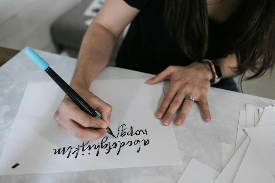
When I first decided to try calligraphy, the sheer number of tools available was a bit overwhelming. Nibs, holders, inks, papers – where do I even start? After some research and a few false starts (more on that later), I've settled on a core set of tools that I believe are perfect for any beginner, including myself. My philosophy is to start simple, understand the basics, and then gradually expand as my skills and interests develop. No need to break the bank on exotic materials just yet.
The Humble Pen Holder and Nibs
The pen holder is the backbone of the calligraphy pen. There are two main types: straight holders and oblique holders.
Straight Pen Holders
I started with a straight pen holder. It looks much like a regular pen, with a slot at the end where the nib is inserted. For beginners, a straight holder is generally recommended as it feels more familiar and allows for a direct approach to writing. I found it easier to control the angle and pressure when I was just getting used to the feel of a flexible nib. My first one was a simple plastic holder, very affordable, and it served its purpose perfectly. It's important to ensure the nib fits snugly – a wobbly nib will lead to frustration and inconsistent lines.
Oblique Pen Holders (My Future Goal)
While I haven't ventured into oblique holders yet, I know they're important for certain scripts, particularly Copperplate and Spencerian. An oblique holder has a flange that offsets the nib to the left, which helps to maintain the correct angle for these sloped scripts. I've heard from more experienced calligraphers that it can feel awkward at first, but once mastered, it provides a natural way to achieve those beautiful, consistent slants. For now, I'm sticking with my straight holder, but an oblique holder is definitely on my wishlist as I progress.
Selecting My First Nibs
Nibs are the heart of the calligraphy pen, the part that actually touches the paper and delivers the ink. They come in a bewildering array of shapes, sizes, and flexibilities. For a beginner like me, the key is to choose a few reliable, forgiving nibs.
Broad-Edge Nibs (My First Exploration)
My first encounter was with broad-edge nibs. These are used for scripts like foundational hand, uncial, and blackletter. They have a flat edge, and the width of the line is determined by the width of the nib itself. When writing, the broad edge is held at a consistent angle to the baseline, and the line width changes as the pen moves. I started with a Speedball C-series nib (specifically a C-2). It's a classic choice for beginners, widely available, and relatively easy to control. The feeling of seeing those thick downstrokes and thin cross-strokes appear simply by turning the nib was quite magical.
Pointed Pen Nibs (My Current Focus)
After a brief flirtation with broad-edge, my true passion lies with pointed pen calligraphy, which uses flexible nibs to create thick downstrokes and hairline upstrokes. This is where I'm spending most of my time now.
G Nib (My Go-To)
My absolute favorite beginner pointed nib is the Nikko G nib. It's a Japanese nib known for its durability, smooth writing, and moderate flexibility. This means it's forgiving enough for me to learn pressure control without being so flexible that it splatters ink everywhere. It's fantastic for both foundational practice and moving into more decorative scripts like Copperplate or modern calligraphy. I highly recommend it to anyone starting out.
Leonardt Principal (My Next Step)
As I gain more control, I plan to experiment with the Leonardt Principal nib. I've heard it's finer and more flexible than the Nikko G, allowing for even more delicate hairline strokes and dramatic thick-to-thin transitions. For now, I'm perfecting my technique with the Nikko G, but the Principal is definitely calling my name.
My Ink Choices for Beginners
Ink is another crucial component. The right ink flows smoothly, adheres well to the paper, and provides a rich, consistent color.
India Ink (My Initial Purchase)
My very first bottle of ink was black India ink. It's readily available, relatively inexpensive, and produces a wonderfully opaque, dark line. However, I quickly learned a crucial lesson: not all India inks are created equal for pointed pen calligraphy. Some brands are too thick or contain shellac, which can clog delicate nibs and be difficult to clean. I now use a calligraphy-specific India ink that is formulated to flow well from my pointed nibs. Always read the label!
Walnut Ink (My Preferred Choice)
My absolute favorite ink for practice, especially with pointed pen, is walnut ink. It comes in crystal form, which I mix with distilled water to my desired consistency. The color is a beautiful, warm brown, and it flows incredibly smoothly from the nib. It's also very forgiving on paper and doesn't tend to feather as much as some other inks. Plus, it's easier to clean from my nibs. I find its natural, earthy tone incredibly appealing and less intimidating than stark black when I'm just focusing on my letterforms.
+ Join Our Writing Community for FREE
Chain Story Online
Fun, free, flash fiction writing with writers just like you. You have ~100 words to begin a story or continue a story and make it yours.
Story Bible Studio
Digital space for writers to plot, plan, and build better stories. Designed by writers for writers. Your final draft awaits.
Paper: The Foundation of My Practice
The paper I use makes a huge difference in the outcome of my calligraphy. Poor quality paper can lead to feathering (ink bleeding along the fibers), skipping, and frustration.
Rhodia Pads (My Essential Practice Paper)
For daily practice, I exclusively use Rhodia pads. They have a wonderfully smooth, non-absorbent surface that allows the ink to glide effortlessly without feathering. The faint grid lines (dot or line grid options are available) are invaluable for maintaining consistent height, slant, and spacing. I started with a plain Rhodia pad, but I quickly moved to their dot grid paper, which I find even more versatile for practicing various letterforms and scripts. It's a game-changer for beginners.
Tracing Paper (For Copying and Experimenting)
I also keep a pad of good quality tracing paper on hand. It's excellent for practicing over existing exemplars or templates. I can print out guidelines or sample alphabets and place the tracing paper over them, allowing me to focus solely on the hand movements without worrying about drawing guidelines myself. It also allows me to experiment with different nibs and inks without committing to my more expensive Rhodia paper.
Cleaning Supplies (Crucial for Nib Longevity)
Proper cleaning of my nibs is paramount. Ink residue can build up, affecting ink flow and potentially corroding the nib over time.
Small Jar of Water
I always have a small jar of water next to my workspace. This is for quick rinses of my nibs between dipping in ink, and for a more thorough clean after each practice session.
Lint-Free Cloth or Paper Towel
After rinsing, I gently dry my nibs with a lint-free cloth or a piece of paper towel. It’s important to be gentle to avoid bending the delicate tines of the nib.
Old Toothbrush (For Stubborn Ink)
For those times when ink gets really caked on, especially with India ink, an old toothbrush is a lifesaver. A gentle scrub with water usually dislodges any stubborn residue.
My First Strokes: Building Fundamental Skills
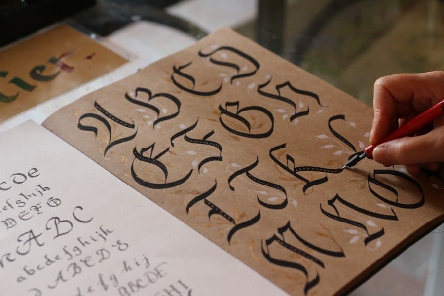
Once I had my basic tools, the real journey began: putting pen to paper. I quickly learned that calligraphy isn't just about drawing pretty letters; it's about developing muscle memory, understanding pressure, and creating consistent lines. My initial practice focused entirely on fundamental strokes, not full letters. This foundational work felt tedious at times, but I understood its importance in building a solid base.
Mastering Pressure: The Thick and Thin
The defining characteristic of pointed pen calligraphy is the contrast between thick downstrokes and thin upstrokes. This is achieved by varying the pressure I apply to the nib.
Hairline Upstrokes
My first exercise involved creating hairline upstrokes. For this, I learned to apply almost no pressure, letting the nib barely skim the surface of the paper. It felt incredibly delicate and required a very light touch. My goal was to create lines that were as thin and consistent as possible. This took a lot of practice, as my natural tendency was to press down too hard.
Pressure-Sensitive Downstrokes
Conversely, for downstrokes, I learned to apply gentle, increasing pressure as the nib moved downwards. This causes the tines of the nib to splay apart, allowing more ink to flow and creating a thicker line. The challenge here was to apply enough pressure for a consistent thick line, but not so much that the nib flexed too aggressively, causing ink splatters or damaging the nib. Finding that sweet spot of pressure was, and still is, a continuous learning process for me.
Essential Basic Strokes
Before attempting any letters, I focused on a series of basic strokes that form the building blocks of most scripts. I printed out practice sheets with these strokes and spent countless hours tracing and replicating them.
The Basic Upstroke and Downstroke
My first and most fundamental practice was simply drawing straight upstrokes and straight downstrokes. For upstrokes, light pressure, thin line. For downstrokes, increasing pressure, thick line. Maintaining a consistent slant (usually around 55 degrees for many pointed pen scripts) was also a critical element I had to keep in mind. I used my dot grid paper to help guide my slant.
The Oval
The oval is another crucial foundational stroke. It forms the basis for many letter bodies (like 'o', 'a', 'd', 'g', 'q'). I practiced drawing perfect ovals, paying attention to the transition from thin upstrokes to thick downstrokes around the curves. This felt incredibly challenging initially, as my ovals often looked lopsided or inconsistent.
The Underturn and Overturn
These strokes are essentially curves that connect letters. An underturn starts with a thick downstroke and curves into a thin upstroke (like the bottom of 'u' or 'n'). An overturn starts with a thin upstroke and curves into a thick downstroke (like the top of 'n' or 'm'). Practicing these repeatedly helped me develop smooth transitions between thick and thin lines.
Compound Curve
The compound curve combines elements of the underturn and overturn, creating an 's' shape. This stroke is particularly good for practicing control and smooth changes in pressure. It felt like a small victory when I could create a relatively consistent compound curve without any jerky movements.
Maintaining Consistency: My Practice Habits
Consistency is the holy grail of calligraphy. Every stroke, every letter, needs to have a similar height, width, slant, and pressure.
Using Guidelines Religiously
I cannot overstate the importance of guidelines. My Rhodia dot grid paper is a lifesaver. I also learned to draw my own guidelines on plain paper using a ruler and a sharp pencil, including a baseline, x-height line, ascender line, descender line, and slant lines. This discipline helps me train my eye and hand to maintain consistent proportions.
Slow and Deliberate Practice
When I started, my instinct was to rush. I quickly learned that calligraphy rewards slowness and deliberation. Each stroke is a conscious effort, not a hasty scribble. I focus on the movement of my entire arm, not just my wrist, to create smoother, more controlled lines. This requires patience, but the results are undeniable.
Short, Regular Practice Sessions
Instead of long, infrequent sessions that lead to fatigue, I find that shorter, regular practice sessions are far more effective for me. Even 15-20 minutes a day, focusing on just one or two basic strokes, yields better results than an hour-long session once a week. It allows my muscle memory to develop gradually and consistently.
Expanding My Repertoire: From Strokes to Letters
Once I felt somewhat comfortable with the basic strokes, I eagerly moved on to forming actual letters. This felt like a significant milestone, a tangible sign of progress. I started with a single, simple alphabet, focusing on connecting the basic strokes I had practiced.
Choosing My First Alphabet
For pointed pen calligraphy, I decided to focus on a foundational script like Copperplate. While modern calligraphy offers more freedom, I wanted to understand the strict rules and discipline of a classical script first. I found a good exemplar (a guide showing all the letters) online and printed it out.
Learning the Minuscules (Lowercase Letters)
I began with the lowercase letters, or minuscules. I tackled them in groups based on their construction, rather than alphabetically. For example, all letters formed with an oval shape (a, d, g, o, q) or letters that share similar entry and exit strokes. This systematic approach helped me see the patterns and connections between different letters. I would practice each letter dozens of times, comparing it to my exemplar, identifying my mistakes, and trying again.
Gradually Incorporating Majuscules (Uppercase Letters)
Once I felt a reasonable level of comfort with the minuscules, I slowly introduced the majuscules (uppercase letters). These often have more flourishes and can be more complex than their lowercase counterparts. I took them one at a time, sometimes dedicating an entire practice session to just one difficult capital letter. The capital 'R' and 'S' were particularly challenging for me, demanding precision and grace.
Connecting Letters and Forming Words
After mastering individual letters (or at least feeling somewhat confident with them), the next step was to connect them to form words. This introduces new challenges related to spacing and consistent baselines.
Understanding Spacing
The space between letters (inter-letter spacing) and words (inter-word spacing) is crucial for readability and aesthetic appeal. I learned to "optically" space my letters, meaning the white space between them appears consistent, even if the measured distance isn't exactly the same. This is a subtle art that takes time to develop. I found it helpful to imagine how much "water" could flow between the letters – I aimed for an even flow.
Maintaining My Baseline
When connecting letters, it's easy for them to wander off the baseline. My dot grid paper was still incredibly useful here, acting as a constant reminder. I consciously focused on returning each letter to the baseline and ensuring a consistent height across the word.
Smooth Transitions
Connecting letters requires smooth transitions between strokes. This is where my practice of underturns, overturns, and compound curves truly paid off. I aimed for a continuous flow, making sure the connecting strokes were hairline thin and didn't detract from the beauty of the individual letters.
If you're diving into the world of calligraphy, it's essential to understand not just the tools and techniques, but also how this art form can fit into your lifestyle. For those considering how creative pursuits like calligraphy can be balanced with work, you might find it interesting to read about the evolving landscape of remote work in 2024. This article explores the benefits and drawbacks of working from home, which can provide insights into how you can incorporate hobbies like calligraphy into your daily routine. Check out the article here for more information.
If you're looking for a collaborative writing platform, check out Chain Story Online. It's a great way to connect with other writers and create stories together. Many users have found inspiration and creativity through Chain Story Online.
My Ongoing Journey and Future Aspirations
My calligraphy journey is far from over; it's an ongoing process of learning, practicing, and refining. I've only just scratched the surface, but the progress I've made has been incredibly rewarding.
Continuous Practice and Learning
I've learned that consistency is key. Even when I don't feel inspired, I try to dedicate a short period each day to practice, even if it's just basic drills. I also continue to seek out new knowledge, whether it's through online tutorials, books, or watching more experienced calligraphers at work. There's always something new to learn, a new technique to master, or a new script to explore.
Experimenting with Different Scripts and Styles
While I've focused primarily on Copperplate for pointed pen, I'm eager to explore other scripts. I'm drawn to the elegant simplicity of Spencerian script, and I also want to delve deeper into modern calligraphy, which offers more freedom for personal expression. I imagine a future where I can confidently switch between different styles, adapting my hand to the demands of each.
Creating Personal Projects
Final Thoughts on Calligraphy for Beginners
Ultimately, my goal is to create beautiful pieces that I can share. I dream of calligraphing personalized cards for friends and family, creating elegant place cards for special occasions, or even framing my own calligraphy art. These small projects keep me motivated and provide a tangible outcome for all my practice. The thought of adding a personal, handcrafted touch to my life and the lives of others is a powerful incentive for me to keep improving. My journey with calligraphy is a marathon, not a sprint, and I'm excited for every step of the way.
Related reading: The Book of Kells: Why It's Still Ireland's Greatest Treasure · Celtic Art Explained: Knots, Spirals and Their Meaning
Enda Storrie is a writer and the creator of Story Bible, the planning journal and app for writers, and Chain Story Online, a free collaborative storytelling platform.